revision
- Revision:
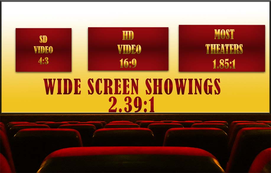
I made the base screen the size of the wide screen ratio so I could use that as the backdrop as if it were a movie screen.
I changed the text because I couldn't figure out why it was pixelating. I tried the anti-alias but it still didn't work.
with the separate boxes I usedthe 'satin' effect' and the drop shadow. I also used a contour on the widescreen to show a little bit of a border.
I changed the hue of the seats using camera raw. I wanted them to look more yellow like they were being lit up by the screen. It also made them look less dull and flat.
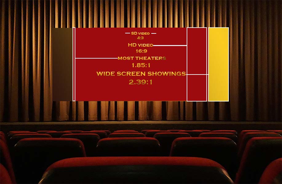
before
|
Background: I chose to do this because aspect ratios for cinematic cameras are something that I want to know better. I definitely learned about them! I had to calculate exact measurements for the height and width of the rectangles.
Design:
-movie theater
Design:
- I used an image of a movie theater to help give the graphic some context.
- Had red and gold as the main colors as they are the colors that remind me of movie theaters
- Made the font match the gradient in the squares for repetition
- made 4 rectangles using the rectangle tool
- filled in the rectangles using the fill tool for two of the boxes and gradient tool for the other two (It should look more obvious, maybe I should make the yellow box have less of a gradient)
- I used Myriad Pro font and increased the size by .5 for each ratio
- I used beveling and embossing with a yellow colored gradient for the gold text
- Made 3 white outlined boxes using the rectangle tool
- made 5 white lines using the line tool to point to which boxes are which
- Imported the theater image and layered it underneath all of the graphics
-movie theater
