revision
Revision:
- changed the font to Bebas Neue
- added red inner glow
- corrected alignment
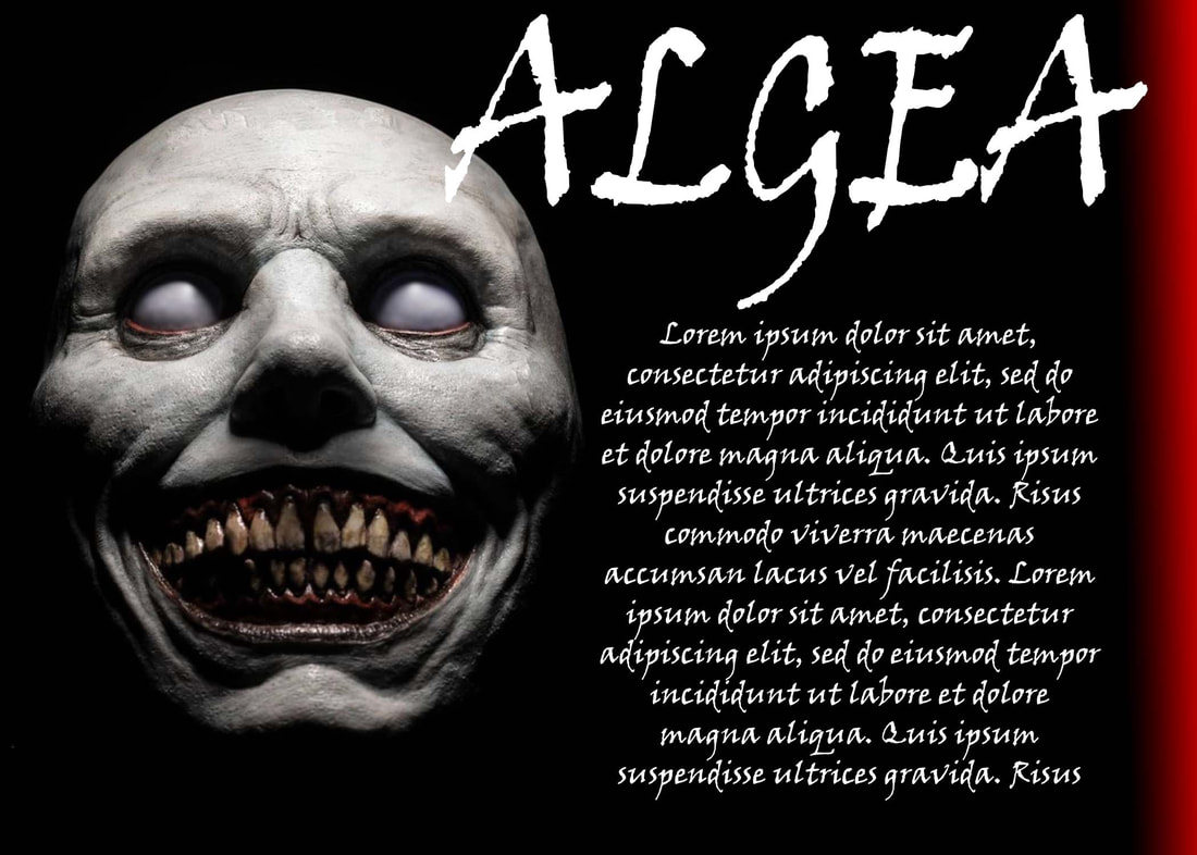 before
Background: I thought hard about what template I would actually use
I came up with a movie insert for a magazine! I like to participate in independent film-making and sometimes they ask me to make posters or social media images. I am going to send these templates to the directors and try to get them into a Utah magazine! There was a little bit of different editing on each template which I will explain below.
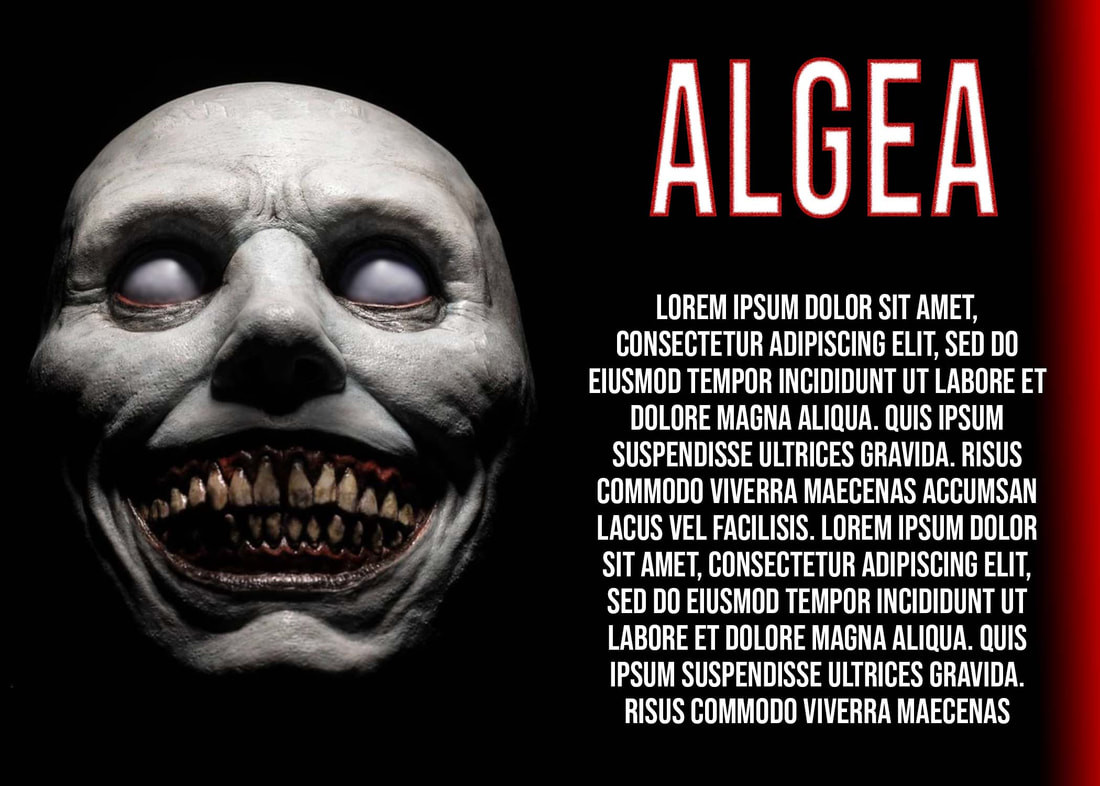
ALGEA
Photoshop:
- I created a new photoshop and had a transparent background if I wanted to reuse the template without a printed color background (like to print on colored paper or save on ink) and left that for the base
- I made a new layer for the background and used the gradient tool changing the colors from black to red and adjusting the fade of them to fall off less
- I imported an image of the Algea from the movie. Since it was black I didn't need to key it but I did draw black on with the brush tool to cover some of the edges better
- I made a layer for the text
- I made a layer for the title
Design:
- Color: The themes of the original movie poster are red and black so I followed that with the gradient and background
- Focal points and alignment is kind of like a flag... heavier on the left side and falling off on the right. I really liked how it looked in the example so I followed that look.
Credits:
- Photos: JD Allen
- Font: Viner Handl TC
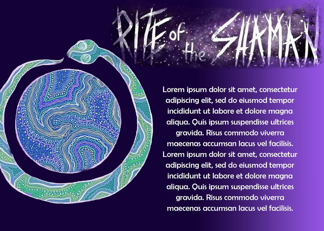
Reused template for another movie
RITE OF THE SHAMAN
Photoshop:
Photoshop:
- I used a .PSDT template from the Algea one that I made
- I changed the gradient on the background to a purple one and changed it to fade to a black - I tried a blue to purple but I felt that it looked cheesy.
- I don't have the font for the movie's title so I took the title from the poster
- I made a layer mask on the title and I used a special effects brush (Kyle's concept foliage brush #306)
- I imported an image from the movie poster (the snake) to replace the scary face. I made a layer mask for that to mask out the background of the poster
- I changed the font in the text layer
- Color: The themes of the original movie poster are purple and blue, the blue looked cheesy so I kept it at a single color gradient of purple.
- I kept the font white to match the title
- Photos: Alicia Farmer
- Font: Berlin sans FB
