Revision:
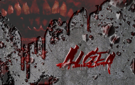
I think that the cast/crew of Algea would be more likely to use a facebook cover. So I reformatted it and I used Ian's advice about how to avoid pixelation.
I can't change the font of "Algea" because that is how they designed it, but I did color it in and create a separate text layer for "God of Pain". I found a font that looked closest to matching which was called "tall dark and handsome"
I also changed up the settings on the beveling and embossing to look better at this format.
Background:
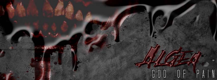
The portfolio challenge said to create a 3D text or object. I wanted to try this with a logo and a paintbrush. I chose to create a creepy looking poster for the movie I'm helping on, Algea: God of Pain. For some reason, something I'm struggling with is things getting pixelated in photoshop, and advice?
I tried to make it look like the villain's smile is in the reflection of some blood splatter
Photoshop:
- downloaded a blood drip png
- used the Algea logo for a layer
- clipped the smile picture to the dripping mask
- used another layer to color the smile to be more red
- found a cement background - I tried just black but it made it hard to read and gray looked cheesy but I thought using a texture would look better
- Used Kyles Spatter Brush to add more
- Color: The themes of the original movie poster are red and black so I followed that. I added a cement background because I felt like it complimented the colors the best without seeming too out of place
- Alignment: I started the blood splatter in the left corner and balanced it out by placing the logo on the right side
- Repetition: I used the bevel and emboss effect on the logo to try and replicate the blood look
- Contrast: The gray and the red contrast each other just enough to allow you to see what is going on.
Credits:
- Kyle's Spatter Brush
- Embossing effect
- JD Allen for both the Algea picture and logo
- Blood drip
- Cement floor
