Revision:
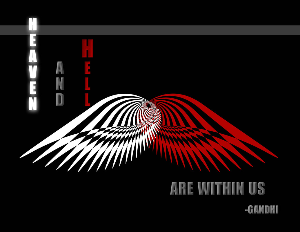
I tried to make this into a facebook cover size, but even though it had smaller pixels I decided to keep it as a classroom poster.
I edited the font to match the feeling:
- "heaven" is now white with a glowing drop shadow
-"hell's" red matches the red wing
- the neutral words took on the color of the gray bar at the top
-the gray seemed to flat so I added a bevel & emboss
Background:
As part of the assignment from the week I played with the pen tool and patterns. I really liked how it ended up. When I copied the wing to the other side I decided to switch the colors and it reminded me of this quote by Gandhi so I made it into a poster
Photoshop:
- Used the pen tool to create one shape
- copy and paste the shape
- rotate the shape anchoring it on the side
- after clicking "enter" I used the command+option+shift+T trick that repeats the previous step over and over
- selected the whole shape created copied, and selected "flip horizontal"
- filled the selection with white and the other with red
- used the vertical and the horizontal text tool
- used gradient from grey to red on the text
- rectangle tool for gray bar
- paintbucket tool to fill in bar
- Color: the base was black and I wanted to use white to make it contrast and stand out - then I used red because it is bright and it has the connotation of "evil" or "hellish". The gradient had that "hellish" look too. I tried white but I didn't like how it looked.
- Alignment: I centered the wings, and counter balanced the text on either side as well as used the verticle and horizontal text to bring variety. I didn't like how the top text looked with extra space... so I added a gray bar to bring some weight.
- Repetition: There was one 'leaf' shape I made and repeated it making it smaller and turning down. Then I mirrored the image.
- Contrast: This whole piece is about contrast. I used color and repetition of the wing to show the juxtaposition
Credits:
- pen tool
- rectangle tool
- Impact font
- gradient tool
- drop shadow
- Gandhi
